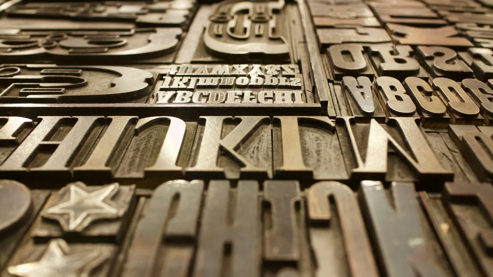
Typography accounts for 95% of web design. The fonts you choose communicate personality, build trust, and directly influence how users process and respond to your content.
Robert Bringhurst's foundational principle — "typography exists to honour content" — is as true for digital design as it is for print. Typography isn't about picking attractive fonts; it's about creating a hierarchy of information that guides users through your content toward conversion. Every UI UX design agency Noida worth working with treats type as the most powerful design tool available.
Typeface Roles and Pairing
Effective typography uses distinct typefaces for distinct roles: a display face (expressive, used at large sizes for headings) paired with a body face (neutral, optimised for readability at 16–18px). Contrasting personalities between the pair create visual interest while maintaining hierarchy. Scult.in's own brand uses Cabinet Grotesk — a geometric sans-serif with subtle character — for both roles, differentiated through weight and size.
The Performance Dimension
Typefaces are assets that load over the network. An unoptimised custom font can add 500ms to page load time. We use variable fonts where possible (a single file handling all weights), self-host via WOFF2 format, and implement font-display: swap to prevent invisible text during loading. Our startup website development projects default to self-hosted typefaces — no render-blocking third-party requests.