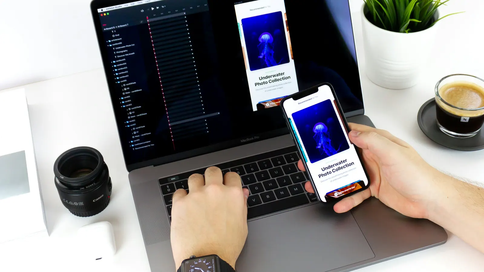
India's mobile internet population is the second-largest in the world. If your website isn't designed mobile-first, you're ignoring your largest customer segment.
With 71% of all website traffic in India originating from mobile devices, mobile-first design is not a trend — it's a business imperative. Our UI UX design agency Noida team has shifted the design process entirely: we prototype on mobile screens first and scale up to desktop, rather than the old top-down approach that invariably produces desktop-centric designs that feel like afterthoughts on phones.
Thumb-Zone Architecture
The average smartphone is operated with one thumb. Key interactions — navigation, CTAs, search, and forms — must fall within the natural thumb arc reachable without shifting grip. This constraint produces cleaner, more focused interfaces. When designing for mobile-first, you're forced to identify what truly matters and eliminate everything that doesn't serve the primary user action.
Performance on Mobile Networks
Design decisions directly affect load time. Every decorative image, custom font, and complex animation has a performance cost that mobile users pay in seconds. Our startup website development team co-owns performance from the design phase — making image format decisions, animation complexity choices, and font loading strategies as design decisions, not afterthoughts left to developers.