Animation in an interface should answer a question the user actually has — where did that go, what just happened, what can I do next — anything else is decoration competing with the task at hand.
The best UI animation is usually invisible in the sense that nobody stops to admire it — it just quietly answers a question the interface would otherwise leave hanging. A card that expands into a detail view rather than being replaced by it tells the user, without words, where that content came from and how to get back. A button that compresses slightly on click confirms the tap registered before the response arrives. That's motion doing its actual job: reducing uncertainty. The moment animation starts drawing attention to itself instead of the task, it has usually stopped helping.
This distinction — motion as communication versus motion as decoration — is the single most useful lens for deciding when to animate something and when to leave it alone.
What Motion Is Actually For
Interface animation earns its cost (and it does have real costs, covered below) when it does one of a handful of specific jobs:
- Establishing spatial relationships. When a list item expands into a full detail screen, an animated transition between the two states tells the user's spatial memory that this new screen is that list item, just larger — which makes the back button intuitive without a single word of explanation. Replace the transition with an instant cut and that relationship has to be reconstructed mentally instead of felt.
- Confirming that an action registered. A button press, a toggle switch, a drag-and-drop — these all benefit from immediate, subtle feedback that confirms the interface received the input, especially when the actual result (a save, an API response) takes a moment longer to arrive.
- Directing attention to what changed. When a new item is added to a list, or a notification arrives, a brief animation draws the eye to exactly what's new, which is more effective than a static change a user might not notice at all in a busy interface.
- Communicating system status. A loading spinner, a progress bar, a skeleton screen that mimics the shape of content about to load — these use motion to say "something is happening, please wait," which measurably reduces the perceived length of a wait compared to a frozen screen with no feedback at all.
- Guiding the eye through a sequence. Staggered entrance animations on a list, used sparingly, can help a user parse a set of items as a group rather than a wall of content appearing all at once.
Notice that none of these jobs are "make the product feel more premium" as a standalone goal. Motion used purely for aesthetic flourish — a hero animation that plays every time a page loads, a decorative parallax effect with no informational purpose — is the category most likely to become a liability rather than an asset, because it adds time and cognitive load without resolving any actual uncertainty for the user.
The Real Costs of Animation
Every animation added to an interface has to justify itself against concrete costs, not just against the absence of animation:
- Time. An animation that takes 400 milliseconds adds 400 milliseconds to every single time a user performs that action. For an action performed occasionally, that's negligible. For an action performed dozens of times a day — opening a frequently used panel, submitting a frequently used form — that time compounds into real, felt friction. Frequency of use should directly inform how long (or whether) an animation runs.
- Predictability and control. Users who know exactly what they want to do next are slowed down by an animation that makes them wait for a transition to finish before they can act again. Power users, in particular, tend to want the shortest possible path between intent and result, which is why many well-designed products let animations be interrupted or skipped by a subsequent input rather than blocking until they complete.
- Performance. Poorly implemented animations — especially those that animate properties like
width,height, ortop/leftinstead oftransformandopacity— can cause visible jank on lower-powered devices, which undermines the entire purpose of using motion to feel more polished in the first place. A janky animation reads as worse than no animation at all. - Accessibility and physical comfort. Certain kinds of motion — parallax scrolling, large-scale zooming, rapid flashing or spinning content — can trigger real discomfort for users with vestibular disorders, and this isn't a minor edge case; it's common enough that it's specifically addressed in accessibility guidelines.
Designing With prefers-reduced-motion
Most modern operating systems expose a system-level setting that lets a user indicate they want reduced motion, and browsers surface this to web content through the prefers-reduced-motion media query. Respecting this setting isn't an optional nice-to-have; it's treated as a baseline accessibility expectation in modern UI design guidelines (including WCAG's guidance on animation from interactions), because for some users, ignoring it isn't a matter of taste — it produces genuine physical discomfort.
Practically, this means every non-essential animation in a product should have a reduced-motion fallback: a cross-fade instead of a sliding transition, an instant state change instead of a bounce, a static loading indicator instead of a spinning one. This doesn't mean removing all feedback for users who set this preference — status changes and confirmations should still be communicated, just through non-motion means (a color change, a checkmark appearing) rather than through movement. Building this in from the start is considerably cheaper than retrofitting it after animations are already hardcoded throughout a codebase.
Micro-Interactions: Small Motion, Outsized Effect
Micro-interactions — the small, localized animations tied to a single control, like a heart icon that pulses when liked, a checkbox that draws its checkmark, a toggle that slides with a slight bounce — are usually where animation delivers the best ratio of delight to cost, because they're brief, contained, and tied to a specific, understood action.
A few properties tend to separate micro-interactions that feel good from ones that feel gimmicky:
- Duration in the range of roughly 100-300 milliseconds for most feedback animations. Faster than that and the eye barely registers it; slower and it starts to feel sluggish for something as small as a checkbox.
- Easing that mimics natural motion — most interface motion benefits from acceleration and deceleration (ease-in-out) rather than constant linear speed, because linear motion reads as mechanical in a way that doesn't match how things move in the physical world.
- A single, clear purpose per interaction. A like button that pulses, changes color, and triggers a burst of confetti particles all at once is doing three things when confirming a single tap needed only one. Restraint is usually what separates an interaction that feels crafted from one that feels like it's trying too hard.
Loading States and Perceived Performance
Motion has a particular job during loading states that's worth calling out separately: managing perceived wait time, which is often more important to how "fast" a product feels than the actual wait time. A skeleton screen — a static outline suggesting where content will appear — tends to make a load feel shorter than a blank screen with a spinner, because it gives the user's brain something to anticipate rather than nothing at all. For very short waits (under roughly 300-400 milliseconds), skipping a loading indicator entirely is usually better than flashing one briefly, since a spinner that appears and disappears almost instantly reads as a glitch rather than useful feedback.
Page and Screen Transitions Deserve Their Own Rules
Beyond micro-interactions, larger transitions between whole screens or pages are their own category with their own risks. A slide, fade, or shared-element transition between two full views can genuinely help orient a user in a multi-step flow — confirming forward versus backward movement through a wizard, for instance, by consistently sliding forward-progress to the left and backward-progress to the right. But full-screen transitions carry a heavier time cost than a micro-interaction, and on a page a user navigates dozens of times a session (moving between a list and its filters, for example), even a well-crafted 300-millisecond transition becomes a measurable tax over a full day of use.
A useful rule of thumb: reserve full-screen transitions for moments where orientation genuinely matters — a checkout wizard, an onboarding sequence, a drill-down from a summary into detail — and default to instant or near-instant transitions for high-frequency navigation where the user already knows exactly where they're going and doesn't need the interface to explain the spatial relationship again.
Testing Motion With Real Devices, Not Just a Design Tool Preview
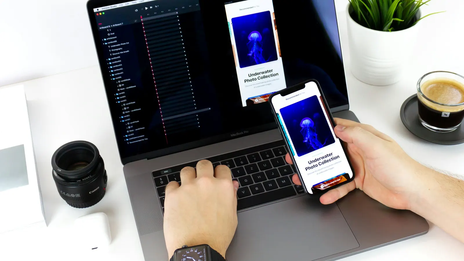
A prototype built in a design tool almost always runs its animations more smoothly than the same animation will run once implemented in production code on a mid-range Android phone, an older laptop, or a browser tab competing with a dozen others for CPU time. Design tool previews are a poor substitute for testing motion on the actual range of hardware real users have, and a design that looks buttery smooth in a curated prototype can ship with visible stutter that undermines exactly the sense of polish the animation was meant to create.
Practical habits that catch this before launch: reviewing animations on a deliberately lower-end test device rather than only the newest phone on the team, watching for animations that trigger layout recalculation (a common performance trap when animating anything other than transform and opacity), and treating "does this still feel smooth under real load" as a launch criterion alongside the more obvious visual review.
When to Say No to an Animation
A practical filter for deciding whether a proposed animation belongs in a product: ask what specific question it answers for the user. "Where did this content come from" is a real question. "Does this feel more premium" is not a question a user is actually asking in the moment — it's a stakeholder preference being retrofitted onto the interface, and it's the category of motion most likely to be cut later once real users start interacting with the frequency and impatience that a design mockup never shows.
Other signals it's worth cutting or reconsidering an animation:
- It runs on every visit to a frequently used screen rather than only on a meaningful state change.
- It can't be interrupted by a subsequent user action.
- It has no reduced-motion fallback.
- It was added late in the process to make a screen "feel finished" rather than to resolve a specific interaction question.
Bringing Motion Design Into a Product Deliberately
Motion works best when it's treated as part of the interaction design from the start — decided alongside how a component behaves, not layered on afterward by a separate animation pass. Teams that treat motion as a late-stage polish step tend to either under-invest in the animations that would genuinely help (state transitions, loading feedback) or over-invest in the ones that don't (decorative flourishes), simply because by that point in the process, the loudest visual moments get the most attention regardless of their actual usefulness.
At Scult, motion decisions get made component by component as part of our UI/UX Design & Branding work, tied to the specific question each animation is meant to answer for the user — which is also why reduced-motion behavior and performance on real devices get checked before a design is called finished, not after a client notices the app feels sluggish on an older phone.