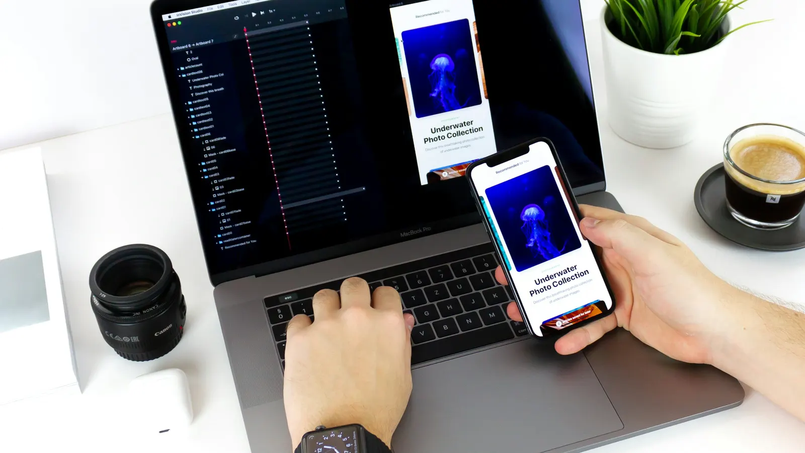
The right starting point isn't a matter of following a trend — it's a matter of where your actual users are, and designing constraint-first tends to produce better results in both directions.
"Mobile-first" has been repeated so often as a default best practice that it's easy to forget it's a design methodology built to solve a specific problem, not a universal rule that applies regardless of context. It was popularized because designing for a small screen's constraints first, then expanding, tends to produce more focused, better-prioritized interfaces than designing for a large screen first and then trying to cram that complexity into a small one. That reasoning is sound in most cases — but "most cases" isn't "every case," and a product whose real usage is overwhelmingly desktop-based (a complex internal dashboard, a professional design tool, a B2B analytics platform) can genuinely be better served starting from the desktop experience.
The decision worth making deliberately, rather than by default, is which environment represents the primary, most demanding use case for a specific product — and designing that environment first, with the discipline that mobile-first methodology popularized, regardless of which screen size it happens to be.
Why Mobile-First Became the Default Advice
The case for mobile-first isn't really about phones being more popular (though for most consumer-facing products, they are, often overwhelmingly so). It's about what small-screen constraints force a design process to confront early rather than late:
- Prioritization becomes mandatory, not optional. A 375px-wide screen has no room for a secondary sidebar, a dense top navigation with eight items, and three levels of nested menus all visible at once. Designing for that constraint forces genuinely hard decisions about what's essential and what's secondary — decisions that a desktop-first process can defer indefinitely, often shipping a bloated interface that never had to make those calls.
- Content hierarchy gets clarified. Without room to spread content across generous whitespace and multiple columns, a small-screen design has to decide, explicitly, what the single most important thing on this screen is. That clarity tends to benefit the desktop version too, once it's built on top of an already-prioritized structure, rather than the other way around.
- Performance constraints are surfaced early. Mobile users are more likely to be on a slower connection or a less powerful device, and designing with that as a starting constraint (rather than an afterthought once the desktop version already assumes a fast connection and powerful hardware) tends to produce a leaner, faster experience across every screen size.
- Touch-target and input considerations get baked in from the start. Elements sized and spaced for a mouse cursor's precision are often too small or too close together for a finger, and this is much easier to correct for from the beginning than to retrofit onto a design that assumed a mouse throughout.
These are all genuinely valuable disciplines. The mistake is treating them as reasons mobile-first is always the right starting point, rather than reasons it's a good discipline to apply to whichever platform is actually primary for a given product.
When Desktop-First Is the More Honest Starting Point
Mobile-first stops being the obviously correct choice for products where the primary, most demanding, most frequent use case genuinely happens on a larger screen, and forcing a mobile-first process onto those products tends to produce awkward compromises rather than better prioritization. Common cases where desktop-first (or at least desktop-primary) is the more honest approach:
- Data-dense professional tools — analytics dashboards, admin panels, spreadsheet-like interfaces, design and editing software — where the core value depends on displaying and manipulating more information at once than a small screen can reasonably hold, and where users are actually sitting at a larger screen for extended, focused work sessions.
- B2B software used primarily during work hours at a desk. A significant share of enterprise and internal tools are genuinely used almost exclusively on desktop, because the job itself (financial reporting, content management, technical configuration) is done at a workstation, not on the move. Designing these mobile-first can result in a beautifully constrained phone experience for a product almost nobody actually opens on a phone, at the cost of a desktop experience that never got equivalent design attention.
- Complex, multi-step configuration or creation workflows where the cognitive overhead of stitching together a task across many small mobile screens genuinely exceeds the benefit of mobile accessibility — video editing, complex form-based configuration, multi-pane comparison tools.
The honest test isn't "which platform seems more modern to design for" — it's "where do our actual or intended users spend the majority of their meaningful time in this product, doing the deepest work." Real usage data, once a product has any, should override methodology preference every time.
Designing Constraint-First, Regardless of Which Screen Comes First
The genuinely valuable part of mobile-first thinking isn't "start with a phone-sized canvas" — it's "start with the most constrained, most demanding version of the problem, and expand from a position of discipline rather than contract from a position of excess." That principle applies whether the constrained environment happens to be a phone screen or, for a different product, a dense professional dashboard that has to remain usable without infinite scroll and infinite whitespace.
Practically, this means:
- Identify which environment forces the hardest prioritization decisions for this specific product, and design that one first.
- Resist the temptation to design the more spacious environment first and "simplify down," which tends to produce a compromise rather than genuine prioritization — most things don't get cut, they just get smaller and more cramped.
- Treat the secondary environment as a genuine adaptation, not an afterthought resize. Content, navigation, and interaction patterns often need to change structurally between a phone and a desktop, not just resize proportionally.
Responsive Breakpoints Are a Technical Detail, Not the Design Strategy
A common confusion is treating "responsive design" (a single codebase that adapts across breakpoints) as synonymous with "mobile-first design" (a design philosophy about where complexity and prioritization decisions originate). They're related but distinct: a product can be built responsively while still being designed desktop-first in philosophy, and vice versa.
When defining actual breakpoints, a few practical patterns hold up well across most products:
- Base breakpoints on where the content naturally needs to reflow — where a two-column layout stops having room to breathe, where a navigation menu needs to collapse into a drawer — rather than on specific device dimensions, since device sizes fragment constantly and a device-specific breakpoint list goes stale quickly.
- Design and test at the actual boundary widths where layouts shift, not just at a few common device presets, since real users browse at an enormous range of window and screen sizes, especially on desktop where browser windows are rarely maximized.
- Treat tablet and mid-size viewports as their own real design consideration, not just an interpolation between mobile and desktop styles. A tablet in landscape orientation often has more in common with a small desktop window than with a phone, and designing it as an afterthought between the two extremes frequently produces an awkward, under-designed middle ground.
Navigation Patterns Rarely Translate Directly Between the Two
One of the clearest signs that a design was adapted rather than genuinely rethought between mobile and desktop is navigation that was simply resized instead of restructured. A desktop's persistent top navigation bar with seven visible items doesn't shrink gracefully onto a phone screen — it either gets crammed into an illegible row of tiny labels or dumped wholesale into a hamburger menu that hides navigation a desktop user never had to hunt for. Conversely, a mobile-first bottom tab bar, built around four or five primary destinations reachable by a thumb, often gets stretched awkwardly into a desktop layout that has far more horizontal space than four icons can use well, leaving the rest of the header feeling sparse and under-designed.
The more durable approach treats navigation as something that's redesigned for each environment's actual constraints and interaction model, not resized: a bottom tab bar or drawer for mobile's thumb-reachable, vertically-scrolled interaction pattern, and a fuller top or side navigation for desktop's mouse-driven, wider-canvas interaction pattern, both expressing the same underlying information architecture through structurally different components rather than one component doing double duty at two sizes.
Input Method Differences Go Beyond Touch-Target Size
Designing across mobile and desktop is often reduced to "make touch targets bigger," which is necessary but incomplete. The two environments differ in ways that affect more than tap size:
- Hover has no mobile equivalent. Any interaction that relies on a hover state to reveal information — a tooltip, a preview, a dropdown that opens on mouse-over — needs an entirely different trigger on a touchscreen, typically a tap that reveals the same information, designed in from the start rather than assumed to "just work" via a tap substituting for a hover.
- Precision differs substantially. A mouse pointer can reliably hit a small, precisely placed target; a fingertip is a much blunter instrument, both in the size of contact area and in how consistently a user can place it in exactly the same spot twice. Small icon-only controls placed close together are far riskier on a touchscreen than the equivalent element under a mouse cursor.
- Keyboard interaction matters more on desktop than most mobile-first-designed products account for. Keyboard shortcuts, tab order, and focus states are often an afterthought in a product designed primarily for touch, even though a meaningful share of desktop power users rely on them heavily for efficiency.
Accounting for these differences explicitly, rather than assuming an interaction pattern from one environment will simply adapt to the other, is where a lot of the real cross-device design work actually happens.
A Practical Way to Decide, Project by Project
Rather than defaulting to mobile-first as an unexamined rule, a more useful process is to ask three questions at the start of a project:
- Where does the primary user actually do the deepest, most frequent work in this product — on the move on a phone, or seated at a larger screen? For an existing product, analytics on device usage settle this quickly; for a new product, the closest available comparable usage pattern is the best available evidence.
- How data-dense or configuration-heavy is the core task? Simple, single-focus tasks (browsing, checking a status, quick actions) tend to translate well to mobile-first thinking. Dense, multi-variable tasks (analysis, bulk editing, detailed configuration) often genuinely need the room a larger screen provides as their primary environment.
- What does the constrained environment force us to get right that we might otherwise skip? Whichever answer to this question produces the harder, more valuable design discipline is usually worth designing first, even if it isn't the platform with the largest expected user share.
Bringing It Together
Mobile-first is excellent default advice for consumer-facing products, content sites, and most SaaS products with individual, self-directed users — which describes a large share of what gets built today, and is exactly why the advice spread as widely as it did. But it's advice built for a specific pattern of usage, not a universal law, and applying it reflexively to a data-dense professional tool or a desk-bound B2B product tends to under-serve the platform that actually matters most to the people using it every day.
At Scult, this decision gets made explicitly at the start of every Web Development and Mobile App Development engagement, based on where a client's actual users are and what the core task genuinely demands — rather than defaulting to "mobile-first" as an assumed best practice regardless of whether the product's real usage pattern supports it.