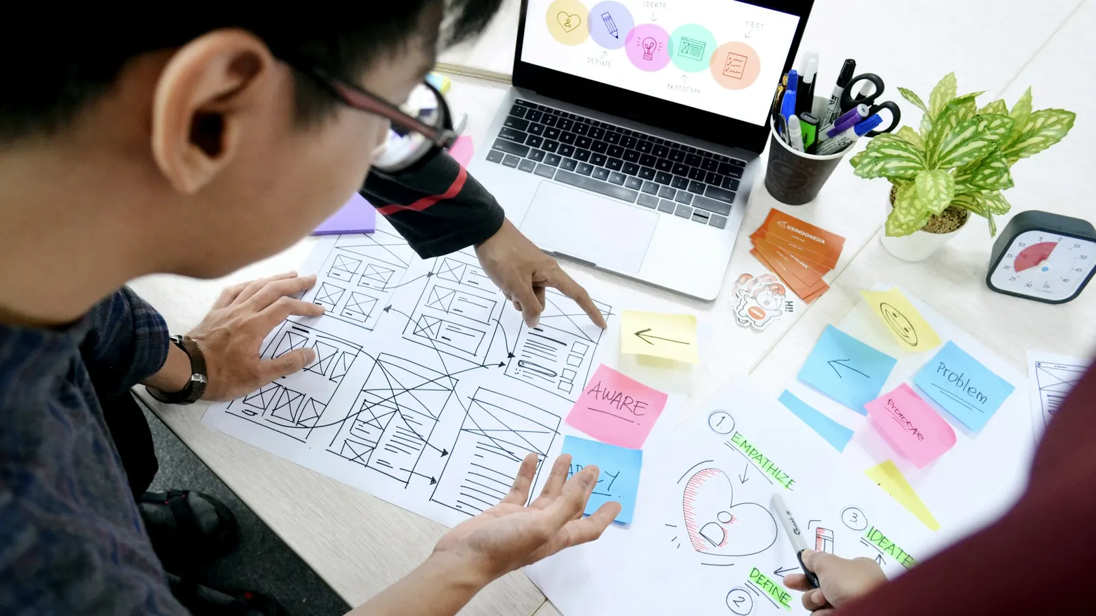
Most "the design doesn't match the build" complaints trace back to a handoff process that never actually specified the details — here's how to close that gap before it costs a sprint.
A designer ships a polished mockup. Three weeks later, the built product has slightly wrong spacing, a hover state nobody specified, and a mobile breakpoint that collapses in a way the designer never intended. Nobody did anything wrong, exactly — the designer designed, the engineer built, and yet the thing that shipped isn't quite the thing that was drawn. This is the handoff gap, and it's less a talent problem than a process problem that shows up on almost every team that treats "designer finishes, then hands to engineering" as a single clean event rather than an ongoing conversation.
Why the Handoff Breaks Down in the First Place
A static design file — even a beautifully organized Figma board — only shows the states someone thought to design. It rarely shows what happens when a text field overflows with a long name, what a button looks like mid-click, how a card grid reflows at 850px wide, or what a loading state looks like for the three seconds between a click and a server response. Engineers build systems, not screenshots, so every gap between "what the mockup shows" and "what the actual product needs to do" gets filled in by the engineer's own judgment during implementation — and that judgment often diverges from what the designer had in mind but never wrote down.
The other structural issue is timing. In a lot of workflows, engineering doesn't see a screen until the designer considers it "done," which means any technical constraint — a component that doesn't exist yet, a layout that fights the existing grid system, an animation that's expensive to implement performantly — surfaces for the first time during build, when changing course costs real time. The fix isn't more detailed mockups after the fact; it's involving engineering earlier, before pixels are finalized on a novel pattern.
Specify States, Not Just the Happy Path
The single biggest source of handoff drift is that most design files only show one state per screen — usually the ideal one, populated with clean sample data. A production interface needs at minimum:
- Empty state — no data yet
- Loading state — data in flight
- Error state — the request failed
- Populated state with realistic data — long names, missing avatars, a number with six digits instead of two
- Interactive states — hover, focus, active/pressed, disabled
Skipping any of these doesn't mean the state won't exist in production — it means an engineer will invent it without design input, on a deadline, without necessarily knowing what "on-brand" looks like for a disabled button or a validation error. A design file that includes all five states for anything non-trivial (forms, cards with dynamic content, anything with a loading dependency) removes the single largest category of "that's not what I meant" conversations after launch.
Redlines and Specs Still Matter, Even With Modern Tools
Design tools that let engineers inspect exact pixel values, spacing, and color hex codes directly from the file have made manual redlining largely unnecessary for basic properties. But inspection mode only answers "what is this value," not "why is it this value" or "does this scale." A few things still need explicit documentation that inspection alone won't surface:
- Spacing logic — is padding based on a fixed scale (8px, 16px, 24px) or an arbitrary value picked to look right in one specific mockup? Engineers need to know if they can safely reuse the pattern or if it's a one-off.
- Responsive behavior — how does a three-column layout become one column, and at exactly what breakpoint? Does the card stack, does content get hidden, does the layout switch to a different pattern entirely?
- Content rules — what's the maximum length before text truncates or wraps? What happens if an image is missing? What's the fallback for a broken avatar?
- Animation and motion timing — easing curves and duration in milliseconds, not just "make it feel smooth." Vague motion direction is one of the most commonly mis-implemented parts of a design, because "smooth" means something different to every engineer.
None of this needs a heavyweight documentation process — a short annotation layer in the design file, reviewed together in a 20-minute walkthrough before build starts, resolves most of it. The goal is making implicit decisions explicit before an engineer has to guess and move on.
Componentize on Both Sides — And Keep the Names in Sync
The handoff works best when a design system component and a code component share both structure and name. If a designer's file has a component called "Primary Button" with defined variants (default, hover, disabled, loading), and the codebase has a <Button variant="primary"> component with matching props, a conversation about updating one button style is unambiguous — everyone knows exactly what "primary button" refers to and where it lives.
When this mapping doesn't exist — when the design file has loosely duplicated button shapes that were never formalized into a true component, and the code has three different button implementations that grew organically — every design change turns into a hunting expedition to find every instance that needs updating, and every code change risks missing a variant the designer didn't know existed. Building and maintaining this shared component library is genuinely one of the highest-leverage investments a product team can make, precisely because it turns "redesign the button" from a multi-file archaeology project into a single source-of-truth update.
Build the Feedback Loop in Both Directions
Handoff friction isn't only about designers giving engineers insufficient detail — it's just as often about engineers not flagging feasibility concerns early enough. A design that requires a custom scroll-jacking animation, or a layout that assumes a font not actually licensed for web use, or a data table that needs to handle ten thousand rows with an interaction pattern that only works smoothly at ten — these are technical constraints a designer often has no way to know about without an engineer in the room.
The practical fix is a short async or live review at the wireframe stage, before high-fidelity design work starts, specifically to flag anything technically risky. This is far cheaper than discovering the same issue after a week of visual polish has gone into a screen that has to be redesigned from scratch. The reverse loop matters too: when an engineer discovers during build that a design decision doesn't hold up (a hover state that doesn't work on touch devices, a fixed-width layout that breaks at a common screen size), that needs to go back to the designer as a design question, not get silently patched by the engineer alone — because a silent patch is exactly how a design system drifts from its own documentation over time.
Version Control for Design, Not Just Code
Engineers work inside a system that tracks every change, attributes it, and lets anyone diff two versions. Most design files don't get the same discipline — a designer updates a mockup, the old version disappears or gets buried in a "v2 final FINAL" naming scheme, and nobody downstream can tell what actually changed since the version they built from. This is a common cause of an engineer building against a stale version of a screen and only finding out weeks later that the design moved on without them.
A lightweight practice that solves most of this: named, dated versions at meaningful milestones ("approved for build — Jan 15"), and a habit of flagging what changed in a screen rather than assuming the change is self-evident from a side-by-side glance. This doesn't need to be elaborate — it needs to exist at all, consistently, which is the part most teams skip once deadlines get tight.
Acceptance Criteria Belong to Both Disciplines
Most teams write acceptance criteria — the checklist that determines whether a built feature is "done" — from a purely functional angle: does the button submit the form, does the API call succeed, does the data save correctly. Visual and interaction fidelity rarely make it into that checklist explicitly, which means a feature can pass every functional test while still drifting noticeably from the intended design, because nobody wrote down that drift as something to check for in the first place.
Including specific visual and interaction criteria in the same acceptance checklist — spacing matches the token scale, the hover and focus states are present and match the spec, the empty and error states render as designed — closes this gap without requiring a separate design-only review pass tacked onto the end of the sprint. It also shifts the responsibility for visual fidelity from being solely a designer's job to catch after the fact, to being a shared definition of "done" that both roles are accountable for from the start. Teams that make this shift tend to see far fewer post-launch design nitpicks, simply because the check happened before the feature shipped rather than after.
QA Passes Should Include a Design Reviewer
A functional QA pass checks that a feature works — the right data loads, the right validation fires, the right page navigates to. It rarely checks that the feature matches the design with the same rigor, because most QA processes are written by and for engineers testing functional correctness, not visual correctness. This gap is exactly why small deviations — a slightly wrong shade, a spacing inconsistency, a missing hover state — survive all the way to production despite passing every functional test along the way.
Adding a lightweight design review step to the same QA cycle — not a full separate review process, just a checklist item asking whether the built feature visually matches the approved design file — catches this category of issue before it ships rather than after a customer or a designer happens to notice it live. This is a genuinely cheap addition to an existing process, and it's disproportionately effective precisely because it targets the exact gap that purely functional QA structurally can't see.
Where This Actually Pays Off
None of this is about adding process for its own sake — every point above exists because it removes a specific, recurring category of rework. Teams that specify states up front spend less time patching error and empty screens post-launch. Teams that keep component names synced between design and code spend less time hunting down every instance of a visual pattern that needs updating. Teams that involve engineering before high-fidelity design work starts catch feasibility problems while they're still cheap to fix.
At Scult, our design and engineering work happens inside the same team rather than across a handoff between separate vendors, which is precisely what removes most of this friction by default — the person building a component and the person who designed it are working from the same source of truth throughout, not reconciling two versions of the truth after the fact. For teams where design and development sit in different organizations entirely, the practices above are the closest substitute: specify every state, keep component naming synced, review feasibility early, and treat the design file as a living, versioned document rather than a one-time deliverable that gets thrown over a wall.