The biggest conversion lifts rarely come from a full redesign — they come from fixing the small, specific frictions sitting between a visitor's intent and the button they need to click.
Most teams reach for a full redesign when conversion numbers disappoint, and most of the time that's the wrong instinct. A redesign changes dozens of variables at once, takes months, and makes it nearly impossible to know which change actually helped. The teams that consistently improve conversion do something less glamorous: they look at the exact moment a user hesitates, clicks the wrong thing, or leaves, and they fix that one moment. A button label, a form field, a line of microcopy, the order of two sections — these are unglamorous edits, and they are also where most of the measurable gains live.
This isn't a case against redesigns; sometimes a product's information architecture is genuinely broken and needs to be rebuilt. But before reaching for that scale of change, it's worth understanding why small, targeted UI edits tend to outperform sweeping overhauls, and which specific changes are worth prioritizing first.
Why Small Changes Outperform Big Redesigns
A full redesign bundles the good changes with the bad ones. If a new homepage layout improves conversion by 8% but a new checkout flow simultaneously hurts it by 5%, the net result looks like a modest win — but you've actually shipped one great decision and one costly mistake, and you have no way to tell them apart. Small, isolated changes let you attribute cause and effect. That attribution is what makes a design process compound over time instead of resetting with every redesign cycle.
There's also a risk dimension. A redesign touches navigation patterns, layout conventions, and visual language that existing users have already learned. Even objectively "better" designs can produce a short-term conversion dip simply because returning users have to relearn where things are. Incremental changes let familiar patterns stay in place while the friction points get resolved individually, so you rarely pay a relearning tax on the parts of the interface that were already working.
The practical implication is a different way of prioritizing design work: instead of asking "what should the new version of this page look like," ask "where exactly, in this specific flow, does a real user hesitate, misread, or abandon." That question points you at line items, not layouts.
The Anatomy of a Button That Converts
Buttons get disproportionate design attention because they are disproportionately important — a button is the single point where intent has to convert into action. A few things reliably matter more than color:
- Label specificity. Generic labels like "Submit" or "Learn More" ask the user to do extra cognitive work to figure out what happens next. A label that names the outcome — "Get My Free Quote," "Start 14-Day Trial," "See Pricing" — removes that ambiguity. This is one of the most repeated findings in usability testing across industries: specificity in a call-to-action consistently reduces hesitation more than color or size changes.
- Visual hierarchy, not just color. A button doesn't need to be red or orange to convert; it needs to be the most visually dominant actionable element on the screen relative to everything competing with it. On pages with multiple CTAs (a primary purchase button next to a secondary "compare plans" link, for instance), the hierarchy between them matters more than either button's individual styling.
- Placement relative to the decision-making information. A CTA placed above the information a user needs to make a decision — pricing, key features, social proof — forces a leap of faith. Testing where a button sits relative to the content that actually resolves hesitation is usually more valuable than testing button color variants.
- Consistent repetition on long pages. On longer landing pages, repeating the same CTA at natural decision points (after the pricing section, after testimonials, at the very end) captures users at the moment they're ready, rather than forcing them to scroll back up.
None of this requires new components or a new visual system. It requires auditing the existing buttons on your highest-traffic pages and asking, for each one, whether its label, position, and prominence match the decision a user is actually making at that point in the page.
Form Friction Is Where Conversions Die Quietly
Forms are the single most under-audited part of most digital products, and they are also where a disproportionate share of drop-off happens, because every additional field is a small tax on a user's patience and trust.
A few specific, well-documented friction points to check:
- Field count versus necessity. Every field on a signup or checkout form should earn its place. "Company size" or "how did you hear about us" might be useful for internal reporting, but if they're not required to complete the transaction, they add friction for a marginal internal benefit. Move optional fields to a post-signup step if the data matters but isn't essential upfront.
- Real-time validation, not after-submit validation. Telling a user their password doesn't meet requirements only after they've filled out the entire form and hit submit is one of the more reliable ways to lose them. Inline validation that confirms a field is correct as soon as it's filled out (or flags an issue immediately) turns a frustrating dead end into a quick correction.
- Error messages that explain, not just flag. "Invalid input" tells a user something is wrong without telling them what. "Password must include a number" tells them exactly what to fix. This single change — specificity in error copy — routinely reduces abandonment on forms that were otherwise well designed.
- Autofill and format tolerance. Rejecting a phone number because it includes dashes, or a card number because it includes spaces, punishes normal human input formatting instead of accommodating it. Forms should normalize input on the backend rather than demanding a specific format from the user.
- Progress indication on multi-step forms. A three-step checkout with a visible "Step 2 of 3" indicator gives users a sense of how much is left, which measurably reduces abandonment compared to an open-ended form with no indication of length.
If you only have time to audit one part of your product for conversion friction, audit the forms. They are usually the most fixable and the most consequential, because they sit at the exact moment where interest has to become commitment.
Above-the-Fold Clarity Beats Above-the-Fold Cleverness
The area a visitor sees without scrolling carries an outsized burden: it has roughly a few seconds to communicate what the product does, who it's for, and what to do next. A surprising number of landing pages fail this basic test in favor of a clever headline, an abstract illustration, or a video that takes a few seconds to load before it explains anything.
A reliable structure for above-the-fold content:
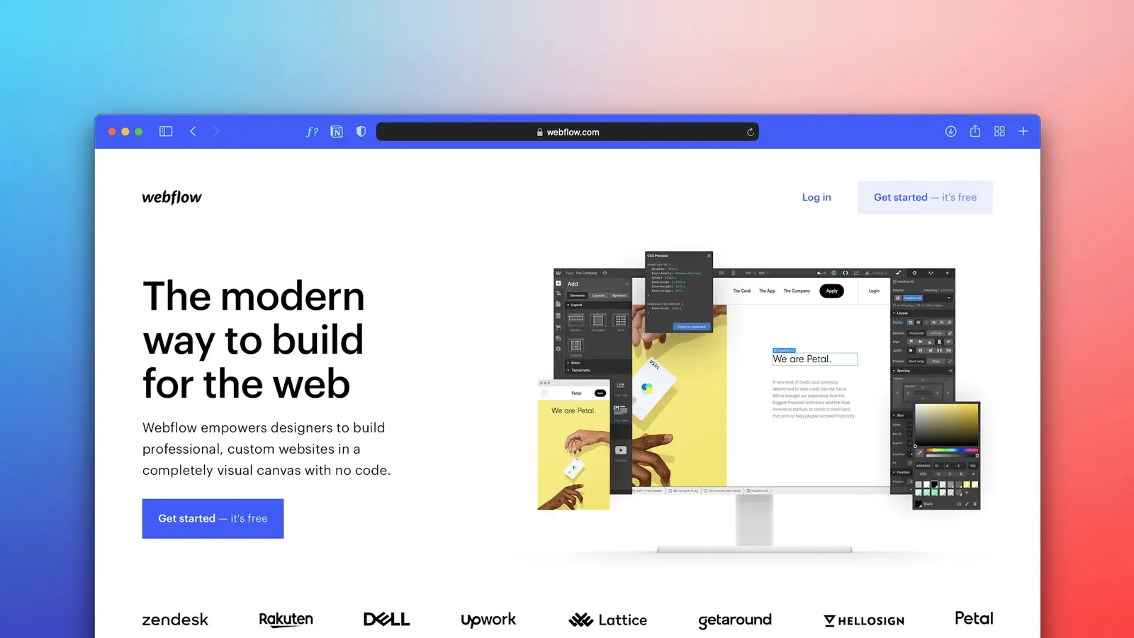
- A headline that states what the product does and for whom, in plain language, not a metaphor that requires the visitor to keep reading to understand it.
- A subheadline that adds the specific outcome or differentiator.
- One primary CTA, visually dominant, with a label that matches what happens next.
- Supporting proof (a client logo strip, a rating, a specific number) close enough to be seen without scrolling, if it exists and is genuine.
The test worth running on any above-the-fold section: show it to someone unfamiliar with the product for five seconds, then ask them what the company does and what they'd click. If they can't answer both questions accurately, the clarity problem is costing more conversions than any visual polish is gaining.
Trust Signals Belong Near the Decision, Not Just on an About Page
Trust signals — testimonials, ratings, security badges, client logos, guarantees — are frequently treated as page furniture, dropped into a footer or a dedicated "Why Us" section that most visitors never reach. Their actual value comes from proximity to the decision point. A refund guarantee placed right next to the checkout button reduces the specific hesitation a buyer feels at that specific moment far more effectively than the same guarantee stated once on an FAQ page.
The pattern worth adopting: map each trust signal to the specific doubt it resolves, and place it at the point in the flow where that doubt actually arises. A security badge belongs next to a payment field, not in the footer. A testimonial about ease of setup belongs near an onboarding CTA, not on the homepage hero. This is a matter of information architecture as much as it is a matter of copywriting or visual design.
The Cost of Choice: Pricing Pages and Plan Comparison
Pricing pages deserve their own mention because they're one of the few pages where the entire purpose is to help a visitor make a decision, and yet they're frequently designed to showcase every plan detail at once rather than to actually guide a choice. A few specific, well-tested patterns worth checking on any pricing or plan comparison page:
- A recommended or "most popular" plan, visually distinguished, reduces the decision paralysis of an unranked list of otherwise equal-looking options. Most buyers appreciate a default recommendation even if they end up choosing differently, because it gives them a starting point instead of an open-ended comparison.
- Feature lists organized by what differs, not everything each plan includes. A visitor comparing three tiers doesn't need every shared feature repeated three times — they need the differences highlighted clearly, since that's the actual information the comparison is for.
- Monthly-versus-annual toggles defaulted to whichever framing is genuinely more common for the buyer, rather than defaulted to whichever number looks smaller for marketing purposes; a toggle that visitors don't trust undermines the credibility of the whole page.
- A single, clear FAQ addressing the two or three objections that come up most in sales conversations (cancellation, contract length, what happens after a trial) placed directly on the pricing page, rather than requiring a support conversation to resolve hesitation that a sentence of copy could have handled.
A pricing page redesigned around decision-making, rather than around listing every feature symmetrically, is frequently one of the highest-leverage small-scope projects a team can undertake, precisely because it sits at the exact point where interest turns into a purchase decision.
Testing Discipline: What to Measure and When
Small changes are only valuable if you can tell whether they worked, which means conversion-focused design has to be paired with a basic measurement discipline, even on modest budgets:
- Pick one primary metric per test — not five. If you're testing a CTA label, the primary metric is click-through on that button, not a blend of pageviews, time on site, and revenue.
- Give tests enough traffic and time before reading results. Reacting to a two-day sample size on a low-traffic page produces noise, not signal. On lower-traffic products, sequential before/after comparison over a longer window is often more honest than a formal A/B test that never reaches significance.
- Segment before concluding. A change that lifts conversion overall might be masking a decline among your highest-value segment (say, enterprise visitors versus casual browsers). Where the data exists, check whether a "win" holds across your most important user segments before rolling it out permanently.
- Document what you tested and why, even for small changes. Teams that skip this step end up re-litigating the same design decisions every six months because nobody remembers what was already tried.
Bringing It Together
Conversion-focused design is less about big creative swings and more about disciplined attention to the specific points where users hesitate, misunderstand, or give up. Button copy, form friction, above-the-fold clarity, and the placement of trust signals account for a large share of the conversion gap between an average page and a genuinely effective one — and all four are fixable without touching the rest of the product.
At Scult, this kind of audit is usually where our UI/UX Design & Branding engagements start on an existing product: before proposing any redesign, we map the specific friction points in the flows that matter most — signup, checkout, demo requests — and prioritize the fixes with the clearest line to revenue. It's slower to look this closely, and it's also the difference between a redesign that feels different and one that actually converts better.