With 70% of Indian web traffic coming from mobile devices, responsive design isn't optional. Here's what truly mobile-first web development looks like in practice.
India is the world's second-largest smartphone market, with over 700 million mobile internet users. If your website doesn't deliver a flawless mobile experience, you're actively turning away the majority of your potential customers. At Scult.in, our website development company Noida team builds mobile-first by default — desktop is the enhancement, not the baseline.
What Mobile-First Development Actually Means
Mobile-first is a mindset, not just a CSS media query. It means designing for the smallest screen first, ensuring touch targets are at least 44x44px, critical actions are reachable with one thumb, and content hierarchy works without a mouse. Our custom website development process starts every project on a 390px viewport before scaling up.
Performance on Mobile Networks
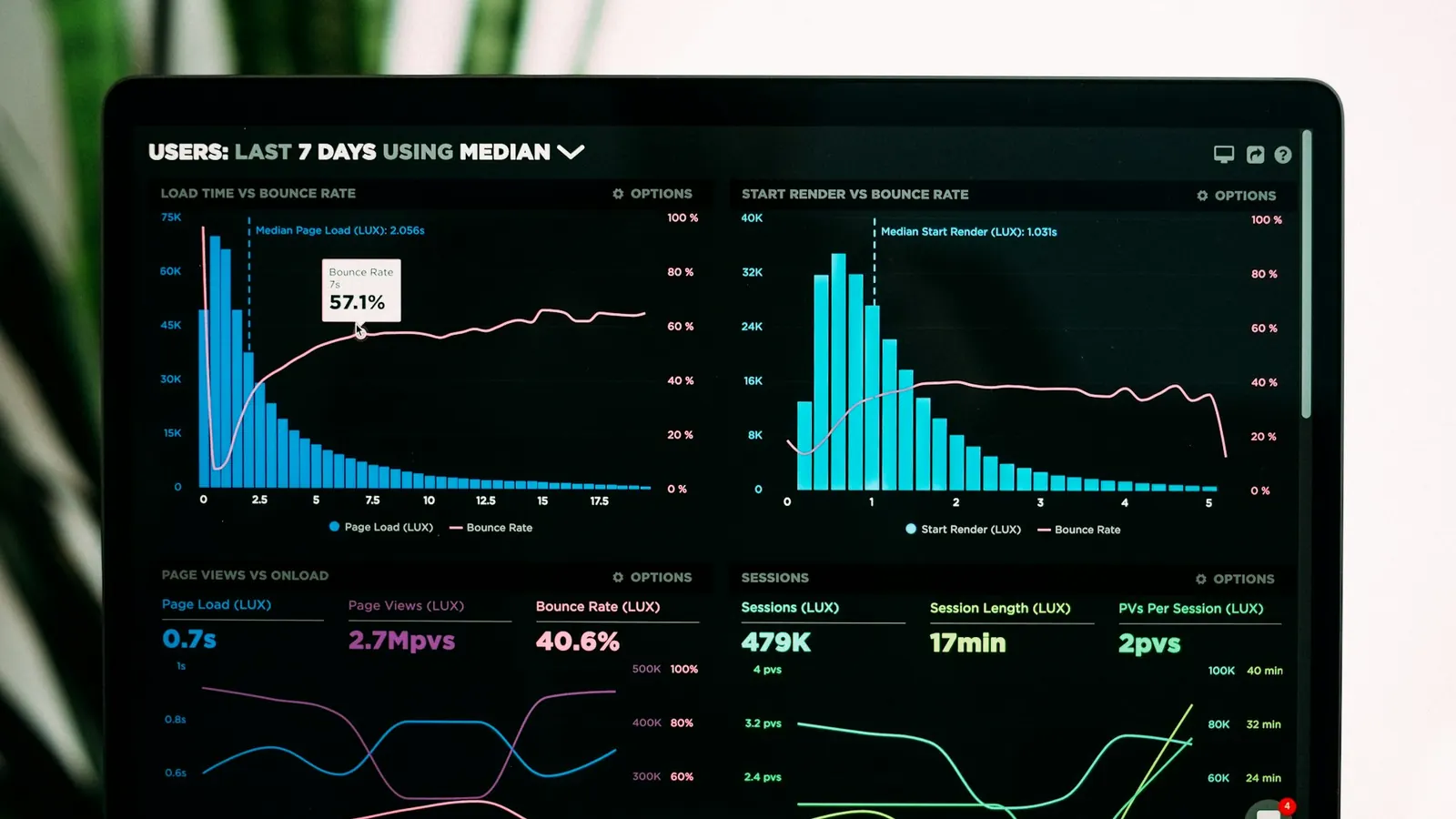
Indian mobile users frequently operate on 4G and 3G connections. Our sites are built with aggressive image optimisation (WebP, srcset), route-based code splitting, and service worker caching — ensuring sub-3-second load times even on average mobile networks. A beautiful responsive design that loads slowly on mobile fails at the most important moment.